


Yoko Co Still Continues to Again Remain Carbon Neutral
We here at Yoko Co are happy to share that we have continued our streak of carbon neutrality…

Understanding Single Sign-On (SSO): Secure, Simple, and Smart Access
What is Single Sign-On (SSO)? Despite the option to use password managers, browsers storing passwords, etc. managing multiple…

Stop Chasing Website Speed Metrics That Don’t Drive Results
Before optimizing load times, make sure to optimize for the right problem. You might’ve read the headline: websites…

5 SEO Fixes You Can Make Today (No Tech Expertise Required)
You know your organization does important work. We know your organization does important work. But if people can’t…

WordPress Security: Separating Fact from Fiction in 2025
WordPress powers 43% of all websites globally in 2025. In fact, you’ll find WordPress behind some of the…

5 Ways to Boost Website Performance Without a Redesign
The world is chaotic and uncertain right now, and this makes committing to large-scale website projects feel risky….

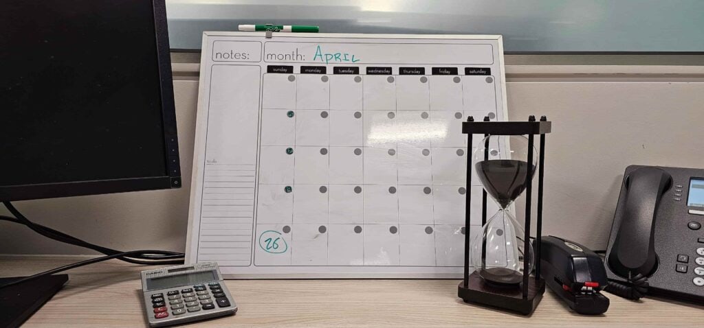
Strategic Website Updates: When to Refresh and When to Rebuild
In our recent article on Strategic Website Evolution, we explored how many organizations treat their websites like new…
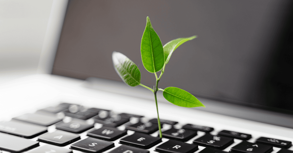
Beyond ‘Set It and Forget It’: Why Strategic Website Evolution Outperforms One-Time Projects
Your website is alive. Not like a zombie—more like a garden. It needs regular care to thrive. But…

Common Website Project Bottlenecks: A Chat with an Expert PM
Expert Advice from Lead Project Manager, Diane Samuelson Starting a website project can be both exciting and daunting….
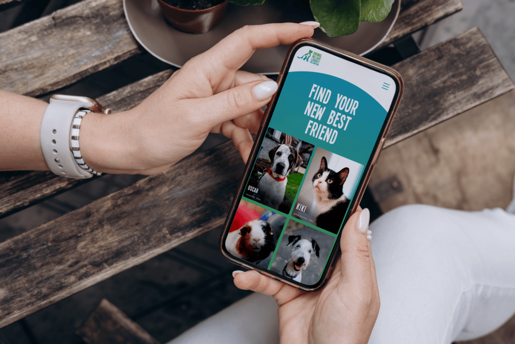
Mobile Experience Tips for Animal Welfare Organizations
For animal welfare organizations, connecting animals with their forever homes is at the heart of everything you do….
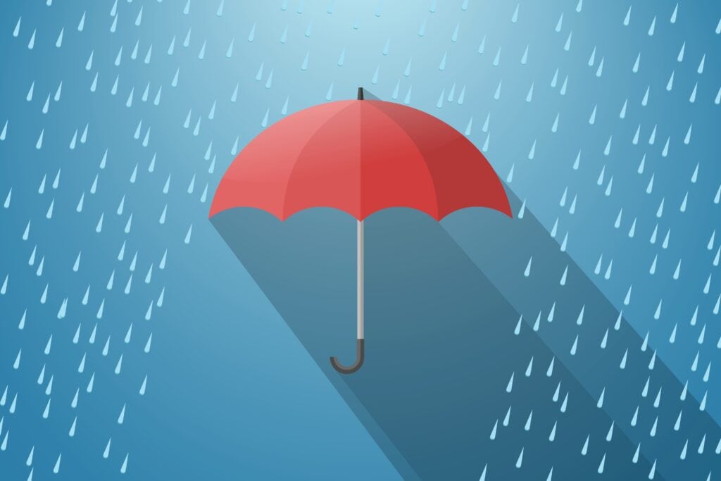
Digital Resilience in Uncertain Times: Building Crisis-Ready Websites
If we’ve learned anything from the past few years, it’s that disruptions can happen without warning. For mission-driven…
Google’s Commitment to AI Search is Good, for Do Gooders